
Using a ggplot subtitle as a color legend
It’s been a while since I written anything, so figured I’d jump into my massive triage of partially written posts and finish one. Let’s talk hotdogs and ggplot.
A couple years ago I stumbled upon Neil Allen’s dataset with the annual results of Nathan’s hotog eating contest. I’ve been holding onto a small snippet plotting the results since 2019, so I thought I’d finally put it to rest by sharing a fun ggplot trick I learned a couple weeks ago.
Let’s first take a look at the data.
# -- Load libraries
library(tidyverse)
library(lubridate)

# -- Read data
# Data courtesy of Neil Allen on Data.World:
# https://data.world/neilgallen/nathans-hot-dog-eating-contest-results
raw_hot_dogs <- read_csv("https://query.data.world/s/unypqzcyoeebpsaik63qleqsvikvzi",
                         col_types = "cfifd") %>%
  janitor::clean_names() %>%
  mutate_at("date", mdy)

head(raw_hot_dogs)
## # A tibble: 6 × 5
## date gender duration name hdb
## <date> <fct> <int> <fct> <dbl>
## 1 2020-07-04 Men 10 Joey Chestnut 75
## 2 2020-07-04 Men 10 Darron Breeden 42
## 3 2020-07-04 Men 10 Nick Wehry 39.5
## 4 2020-07-04 Women 10 Miki Sudo 48.5
## 5 2020-07-04 Women 10 Larell marie Mele 18
## 6 2020-07-04 Women 10 Katie Prettyman 15This data contains the number of hot dogs eaten by contestant per date. The fields are self explanatory, but thought I’d point out two observations: the contest is held annually on the Fourth of July, and duration (probably time in minutes) dropped from 12 to 10 in 2008. We’re going to plot the number of hot dogs eaten per contestant over time, but first let’s see how many records we have for each year.
raw_hot_dogs %>%
ggplot(aes(x = year(date),
fill = gender)) +
geom_bar(alpha = 0.6, position = "identity") +
theme_light() +
labs(x = "Year",
y = "",
title = "Number of contestants competing in the Annual Nathan's Hot Dog Eating contest")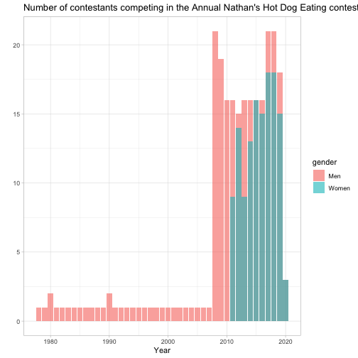 There aren’t many records before the 2008 competition, and looks like the womens division started in 2011. So for the sake of completeness, I’ll work with data between 2008-2020 (although it looks like there were only a few women who competed in 2020).
plot <- raw_hot_dogs %>%
  add_count(gender, year(date), name = "contestants_in_year") %>%
  filter(contestants_in_year > 1 & year(date) > 2000) %>%
  ggplot(aes(x = year(date),
             y = hdb)) +
  geom_point() +
  scale_x_continuous(breaks = 2007:2020, minor_breaks = NULL) +
  facet_grid(gender~.) +
  theme_light()

plot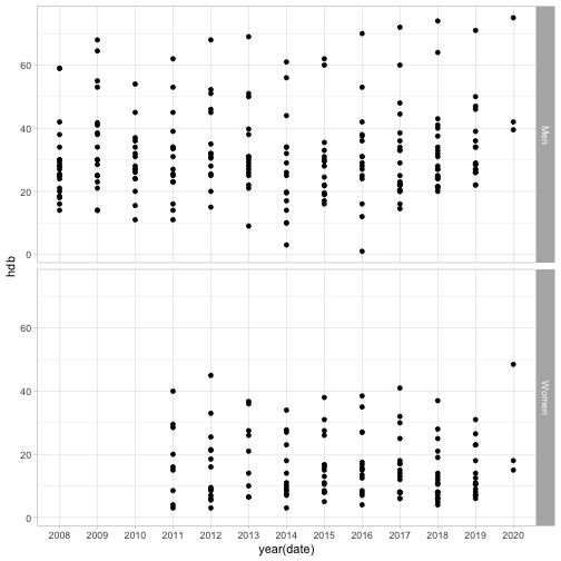
That’s a good start. But let’s clean up the axes and add a title.
plot +
  labs(x = "",
       y = "Hot dogs",
       title = "Number of dogs eaten at the annual Nathan's Hot Dog Eating Contest",
       caption = "Nathan's Hot Dog Eating Contest results from 2007-2020\nCreated by: @OTStats | Data: Data.World @neilgallen")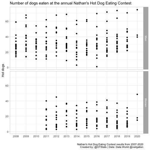
Not bad, but let’s spice this up a bit. Joey Chestnut is well-known as the greatest eater in history. So let’s highlight his records.
plot +
  geom_line(data = raw_hot_dogs %>%
              filter(name == "Joey Chestnut" & year(date) > 2007),
            aes(x = year(date),
                y = hdb), color = "#FF2700") +
  geom_point() +  # I don't have to add `geom_point()` again, but I do so the line is behind the point
    labs(x = "",
       y = "Hot dogs",
       title = "Number of dogs eaten at the annual Nathan's Hot Dog Eating Contest",
       subtitle = "Joey Chestnut is consistently in a league of his own",
       caption = "Nathan's Hot Dog Eating Contest results from 2007-2020\nCreated by: @OTStats | Data: Data.World @neilgallen")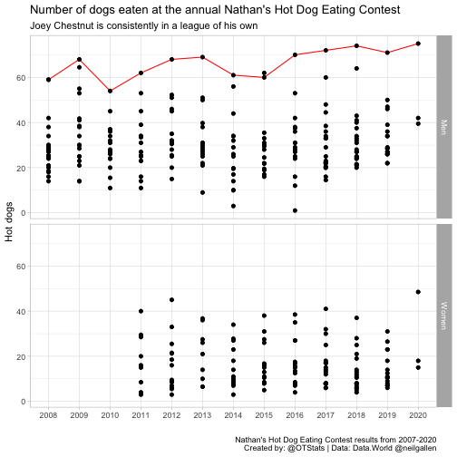
This is better, but we don’t have a way to indicate that the red line is Joey Chestnut. Using the ggtext package, we can color “Joey Chestnut” in the subtitle to also serve as a legend. Here’s how:
library(ggtext)

plot +
  geom_line(data = raw_hot_dogs %>%
              filter(name == "Joey Chestnut" & year(date) > 2007),
            aes(x = year(date),
                y = hdb), color = "#FF2700") +
  geom_point() +
  labs(x = "",
       y = "Hot dogs eaten",
       title = "Number of dogs eaten at the annual Nathan's Hot Dog Eating Contest",
       subtitle = "<span style='font-size:12pt'><span style='color:#FF2700;'>Joey Chestnut</span>
       is consistently in a league of his own
       </span>",
       caption = "Nathan's Hot Dog Eating Contest results from 2007-2020\nCreated by: @OTStats | Data: Data.World @neilgallen") +
  theme(plot.title = element_text(size = 14),
        plot.subtitle = element_markdown(lineheight = 0.5))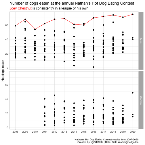
Much better. Within thelabs ggplot layer I designated the size and color of the text within the <span> argument, then added plot.subtitle = element_markdown(lineheight = 0.5) in the theme layer. This is definitely one of my favorite ggplot tricks, now!
Update 2021-12-21
I realized it would be useful to link the ggtext package documentation, which has a ton of practical examples of incorporating text elements in ggplot labels.