
NHL 2024 Cumulative Goal Differential Plot
The NHL season is on its mid-season break for the All Star game and I wanted to take a look at how teams have performed so far. My goal was to learn something new and create a chart that I haven’t made before. I had recently started following Brad Congelio on social media and I was inspired by one of the charts he recently made. He shared a chart that visualized the cumulative EPA across NFL’s offensive plays of the season. To my understanding, EPA is a metric that quantifies a team’s potential to score (or allow the other team to score) based on the result of a particular play.
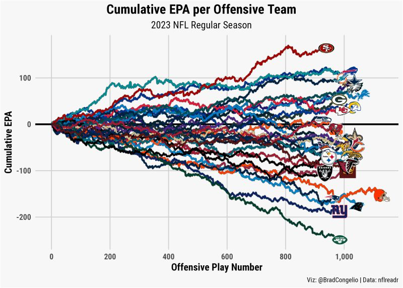
There’s a lot for the end user to process in this chart. There are a lot of colors making it a little challenging to follow a single team over the course of the season. However, the aspect of this chart I found that was most interesting was that I was quickly able to identify teams the top/bottom performing teams. Upon first glance, my eyes are immediately drawn to the top right and bottom right areas of the plot. Within seconds I learned that the Jets, Giants, and Panthers have been on a downward trajectory all year, meaning their offensive plays have actually resulted in a better chance for the opposing team to score. On the positive side, the 49ers, Bills, and Dolphins are effective creating opportunities to score.
I wanted to replicate this data viz for NHL teams’ cumulative goal differential over the course of the season so far. I began by downloading shot-level data from MoneyPuck.com. There are probably better ways to obtain goals NHL scores for this season, but I’m super familiar with MoneyPuck data and it was the fastest way to get up and running. I aggregated goals events by game to get the final scores for each team (goals for and goals against), then calculated the single game goal difference and calculated the cumulative goal differential across the season thus far.
For team logos and their primary colors I found Iván Villanueva’s Github repository that scraped primary colors, logos, and player pictures from ESPN. This was incredibly helpful and saved me a ton of time.
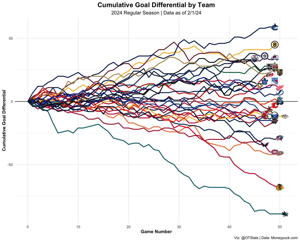
I think the final result is comprehensive and similar to Brad’s. The best/poorest performing teams, in terms of total goal differential to date, align with the teams at the top and bottom of the league respectively. It’s easy to pick a team like the San Jose Sharks, and follow them over the course of the season and see that they started very poorly, had a good stretch between games 5 and 15, and haven’t found any form since.
This does chart has its share of imperfections and limitations.
For starters, Iván’s script was written over 3 years ago and doesn’t include the primary colors of a couple expansion teams (e.g. Seattle Kracken) — as a result Seattle’s line in the chart isn’t present (I’m bummed I haven’t had the time to fix this yet, but hoping to fix this for future NHL charts).
I also think it’d be interesting to use gghightlight and highlight a single team’s progression over the season.
It’d be a great way to draw attention to a specific story line.
You can reference my source code for this plot here — as always, I’m happy to answer any questions about my process or code. Thanks for reading!